GALLERY: STUDENT WORKSGALLERY: STUDENT WORKSGALLERY: STUDENT WORKS
Gallery: Professional Work
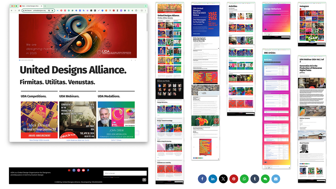
Date: 2020~Present. Medium: Wordpress. Dimensions: Interactive & Responsive Website Design. Duty: Total Design, operation, copy writing, key image, layout, webmaster http://uniteddesigns.org/. Project Description: United Designs Alliance (UDA) is a global organization that serves designers, educators, and students in communication design. To create a sustainable and forward-looking UDA website, I must emphasize strategic planning, aesthetic consistency, and the use of cutting-edge technology. Established in 2014, UDA strives for long-term relevance, so the website should reflect its enduring values and align with its slogan, "Firmitas. Utilitas. Venustas." By applying modern design principles, I can ensure that the site remains engaging and functional for years.
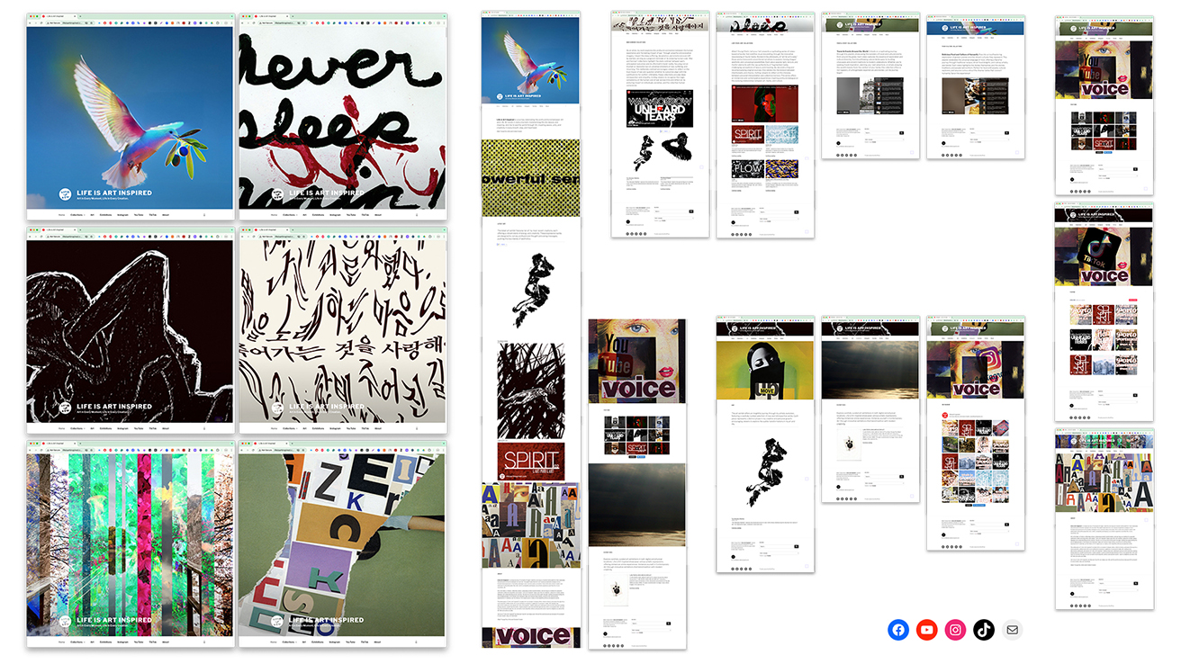
Date: 2024~Present. Medium: Wordpress. Dimensions: Interactive & Responsive Website Design. Duty: Total Design, operation, copy writing, key image, layout, webmaster http://lifeisartinspired.com/. Project Description: “Life is Art Inspired” was founded in 2024 as a journey to celebrate the deep connection between art and life. Art is present every moment, transforming our experiences into beauty and meaning. I invite visitors to view the world through the lens of art, fostering peace, unity, and creativity in every breath, step, and heartbeat. I created the “Life is Art Inspired” website and video content for YouTube and TikTok to explore the significant relationship between art and life. I aim to promote a harmonious and reflective appreciation of everyday experiences through art.
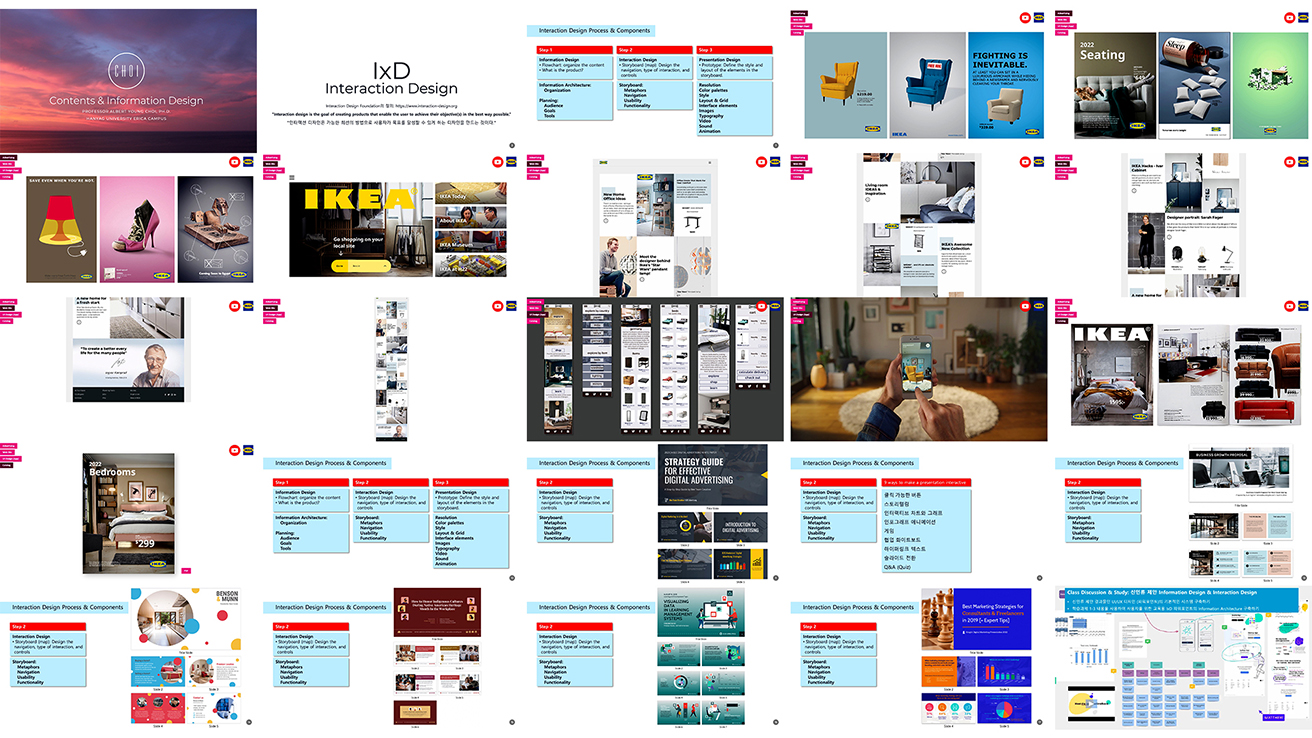
Date: 2024. Medium: Microsoft PowerPoint. Dimensions: 16:9 Interactive Design. Duty: Total Design, contents, interactive design. Project Description: Information design is a technique for conveying information efficiently and effectively. In this class, students learn to analyze content objectively and create useful information while researching the best design strategies to communicate compelling messages. I utilize interactive course materials to help my students reinforce their learning and deepen their understanding of information design.
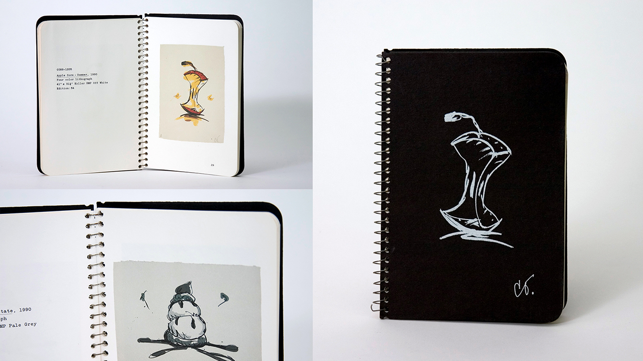
Date: 1995. Medium: Offset Lithography. Dimensions: Pocket Size. Duty: Layout, typography, production design, color correction, press direction. Project Description: Claes Oldenburg is an influential artist who is celebrated for his bold and whimsical interpretations of everyday objects. He has an extensive catalog of works, including collaborations with Gemini G.E.L. (Graphics Editions Limited). Gemini is a Los Angeles-based artists' workshop and publisher known for producing fine art prints and sculptures in collaboration with prominent 20th-century artists. Oldenburg's partnership with Gemini led to a series of limited-edition silkscreen prints and other works that explore his unique vision in two-dimensional and three-dimensional formats.
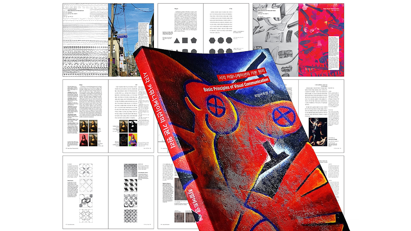
Date: 2023. Medium: Offset Lithography. Dimensions (mm): 140 x 225, 212 pages. Duty: Total Design, writing, contents, writing, key images, and design. Project Description: The book "Basic Principles of Visual Communication" comprehensively explores essential visual theories, concepts, techniques, and the fundamental language of visual design. It is a valuable resource for design education, equipping learners with the necessary skills to become professional designers and artists. The book delves into the principles of visual communication, helping responsible designers enhance their visual perception abilities. By simplifying complex theories with relevant design examples and providing engaging self-study tasks, I make the learning experience accessible and practical.

Date: 1993. Medium: Package Design. Dimensions: Wine Labels and Packages. Duty: Concept, mock-up, production, press check. Project Description: Quady Wine is a highly regarded winery in California, celebrated for its exceptional dessert wines. We had the opportunity to redesign the labels and packaging for Quady's dessert wine line to create a fresh identity that appeals to today's dessert wine market. Our design approach incorporated elements of contemporary art, resulting in a visually striking and unique product.

Date: 2006. Medium: Offset Lithography. Dimensions: A4. Duty: Banner, layout, typeface design, typography, photography, image/color corrections, production. Project Description: A character from the popular Korean drama ‘Palace’ appeared in the cover design of a Korean Wave magazine published by the Korea Tourism Organization (KTO). A refreshing young woman wearing traditional clothing, a symbol of cutting-edge science and communication technology, embodies the essence of the Korean Wave and modern Korea. I chose the “AC Young” typeface as the main font to reflect modern and sophisticated Korean culture. This unique design received great response, and many foreigners collected Korean Wave magazines as souvenirs.
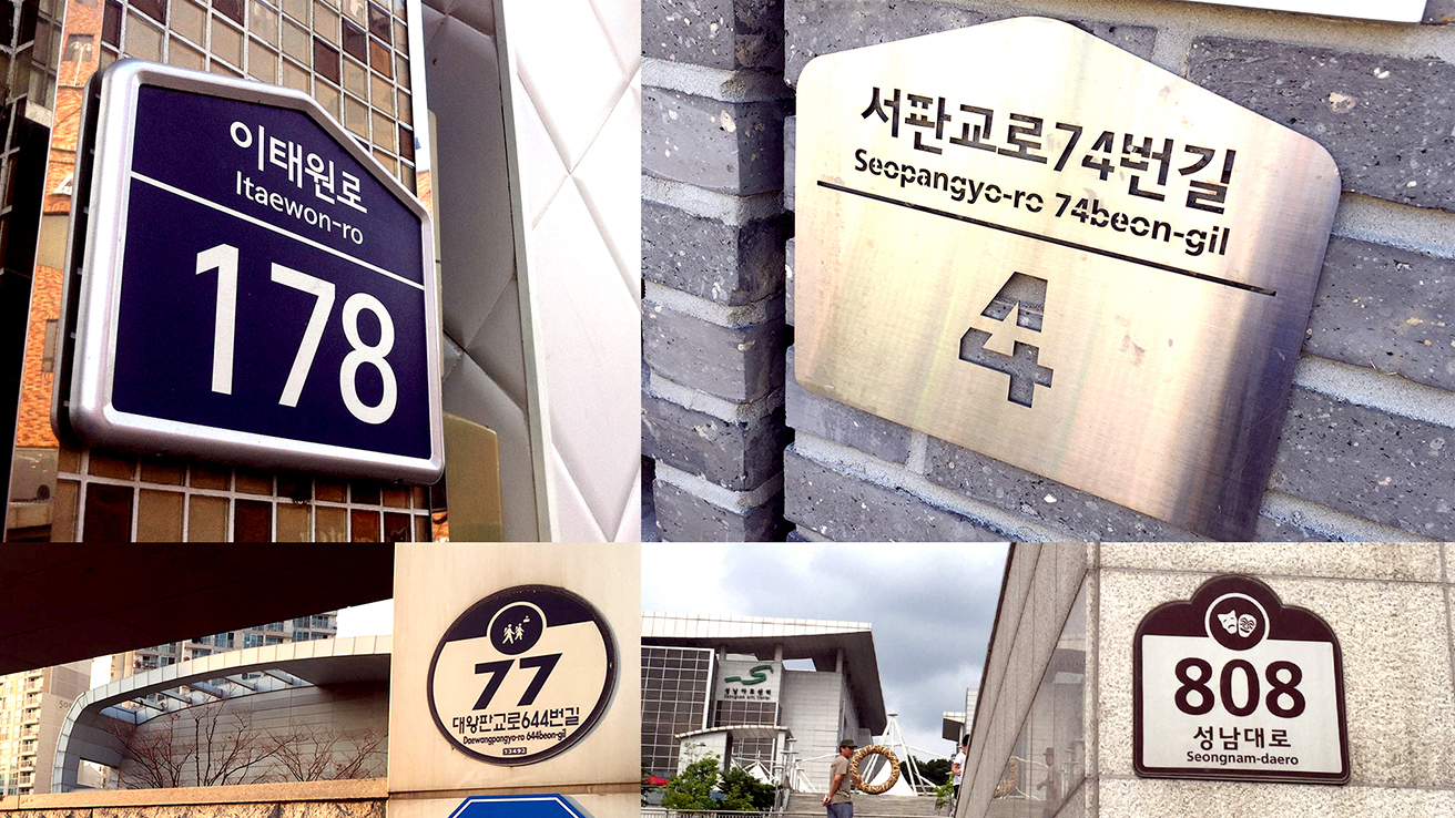
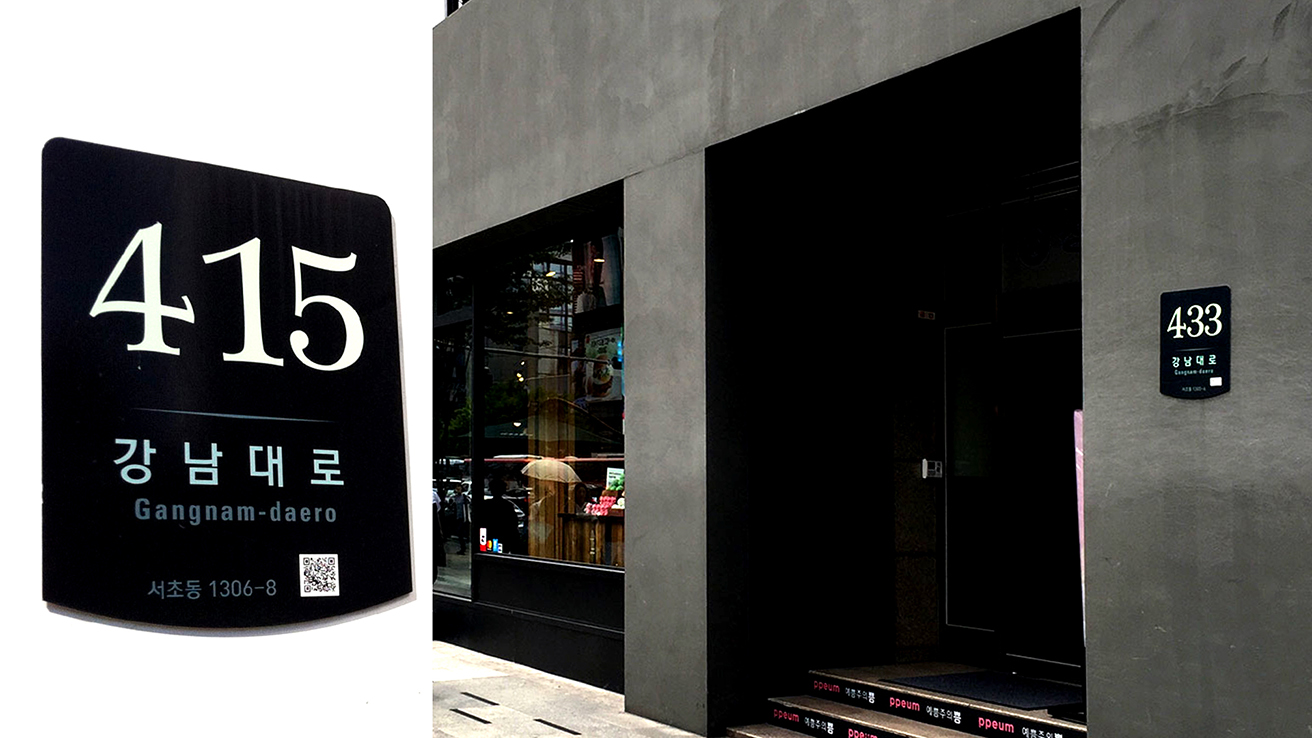
Date: 2008. Medium: Manufactured Signage. Dimensions (mm): 260 x 215 to 400 x 400 based on the building purpose. Duty: Total Design, Chief Researcher and designer (handling a team of 25 lab assistants, 4 survey and site researcher from UK, HK, USA, 5 government advisors, 5 manufacture advisors, and 1 statistic manager). Project Description: Korea's diverse regional culture and environment greatly influence its overall cultural landscape. A standardized design system for building number signs is essential to effectively represent this uniqueness, allowing for personal expression while maintaining consistency. Buildings are classified into residential and commercial categories, encompassing cultural heritage sites and tourist attractions, highlighting the significance of the tourism industry. The design process includes options for three distinct typefaces—classical, modern, and hybrid—ensuring that each sign reflects the character of its respective region. Despite the variety in designs, the maintained sizes and shapes foster a cohesive visual identity across the country's building number signs.
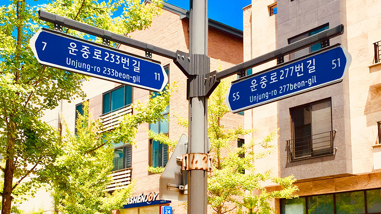
Date: 2008. Medium: Manufactured Signage. Dimensions (mm): 700 x 260 to 3850 x 700 based on the street type. Duty: Total Design, Chief Researcher and designer (handling a team of 25 lab assistants, 4 survey and site researcher from UK, HK, USA, 5 government advisors, 5 manufacture advisors, and 1 statistic manager). Project Description: The distinctive beauty of Korea is characterized by both flowing curves and the straightforwardness of straight lines. The basic design of the road nameplate captures the expressions of Koreans through the elegance of traditional soft curves. At the same time, the Hangeul font, known for its straight lines, symbolizes the honesty of the road. These road nameplates embody the balance of yin and yang, setting them apart from public design elements in neighboring countries and enhancing the national brand image. Furthermore, this design promotes the establishment and standardization of a new address system that uses road names and building numbers, creating an environment that is easily recognizable and accessible to all citizens.
Date: 2009. Medium: Manufactured Signage. Dimensions (mm): 260 x 215 to 400 x 400 based on the building purpose. Duty: Total Design, Chief Researcher and designer (handling a team of 5 lab assistants, 1 government advisors, and 2 manufacture advisors). Project Description: The design concept for the wayfinding system in Seocho-gu, Seoul, integrates micro, wayshowing, and macro elements to create a user-centered experience. It emphasizes simplicity, connectivity, and legibility at the micro level while efficiently providing meaningful information. The wayshowing structure employs branding and clear directions, ensuring seamless navigation. The design considers regional contexts on a macro scale and incorporates location-based guidance, multilingual support, and context-specific directions. This comprehensive approach enhances usability and navigation efficiency, fostering a cohesive and intuitive wayfinding experience for locals and visitors.
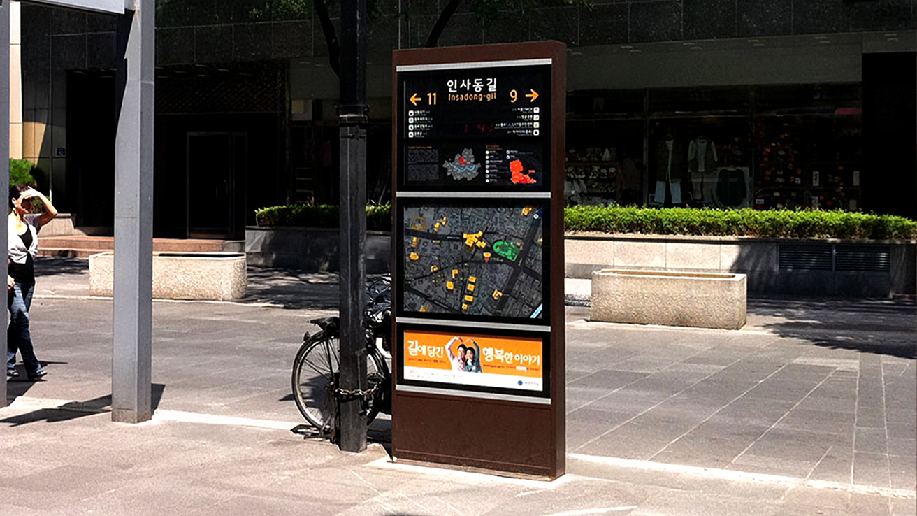
Date: 2008. Medium: Manufactured Signage. Dimensions (mm): 500 x 2100 x 150, 500 x 2500 x 150, 1000 x 2500 x 180. Duty: Total Design, Chief Researcher and designer (handling a team of 25 lab assistants, 4 survey and site researcher from UK, HK, USA, 5 government advisors, 5 manufacture advisors, and 1 statistic manager). Project Description: The design of regional guide signs aims to enhance the road environment by considering the area's characteristics, the needs of pedestrians, and the road itself. These signs provide precise location and transportation information for destinations within a 10-minute walking distance, facilitating more straightforward navigation. The regional guide section highlights the area's unique features, raising awareness among tourists and fostering local pride. The road name guide section also serves as a pedestrian-friendly identification of road names. Three models of regional guide signs—small, medium, and large—are available for installation in tourist areas and locations with high pedestrian traffic, allowing for tailored selection based on specific road environments and wayfinding needs.
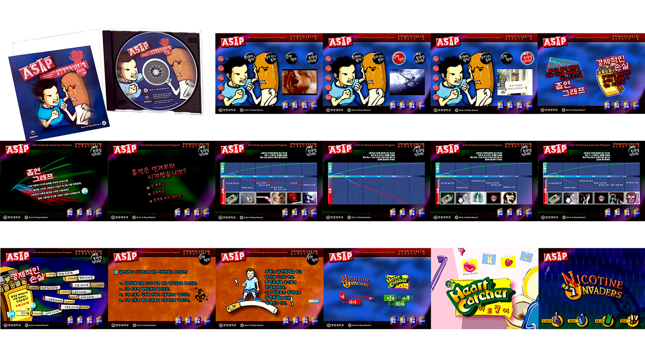
Date: 2003. Medium: Published Digital CD-Rom. Dimensions: Interactive Multimedia Design. Duty: Total Design, Chief Researcher and designer (handling a team of 5 lab assistants, 3 government advisors, 1 manufacture advisors, and junior high school teachers). Project Description: The Anti-Smoking Awareness Program (ASAP) was created for 7th and 8th grade teens by the National Commission on Youth Protection in collaboration with Hanyang University. It is based on the theories that adolescents can identify false social information, resist social pressures to smoke, and recognize the physical harms of smoking in their lives. The program features an interactive multimedia CD-ROM that presents information in a relatable way, making it easy for middle school students to understand. To enhance its impact, ASAP also provides posters and screensavers for display in common areas such as schools and gaming centers. Additionally, the program includes an 'InfoCard' for students who are trying to quit smoking or facing temptation, offering them support and strategies to resist.
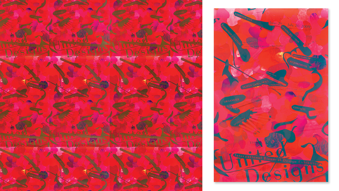
Date: 2009. Medium: 6-color Offset Lithography. Dimensions: A0. Duty: Total Design, typeface design, typography, photography, illustration, image/color corrections, layout, production, press direction. Project Description: This event poster received the Bronze Award at the Hong Kong International Poster Triennial 2010 and the Gold Award at the Graphis Poster Annual 2011. The 4th United Designs exhibition was held from June 29 to July 24, 2009, at California State University, Northridge, featuring 195 designers and eight firms from 23 nations. Organized by the UDA team, the exhibition highlighted environmental awareness through impactful poster designs and showcased design trends from Los Angeles. This collaboration aimed to enhance communication skills among designers and students, emphasizing the universal purpose of design.
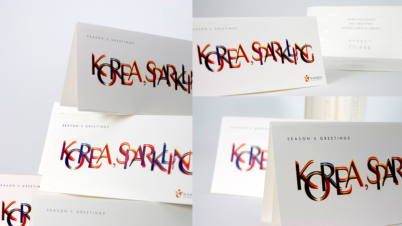
Date: 2008. Medium: 20-color Offset Lithography. Dimensions (mm): 200 x 100. Duty: Total Design, typeface design, typography, illustration, image/color corrections, layout, production, press direction. Project Description: The card highlights Korea's vibrant identity with the slogan "KOREA, SPARKLING," which captures the country's lively spirit through bold typography inspired by the "AC Young" typeface I designed. The twelve dynamic colors of the text represent energy and celebration, while a harmonious palette of red, blue, orange, and purple emphasizes the fusion of tradition and innovation. The clean white background adds a touch of sophistication and modernity. Additionally, the subtle inclusion of the Korea Tourism Organization logo enhances brand recognition, inviting a global audience to experience Korea's unique charm throughout the year.
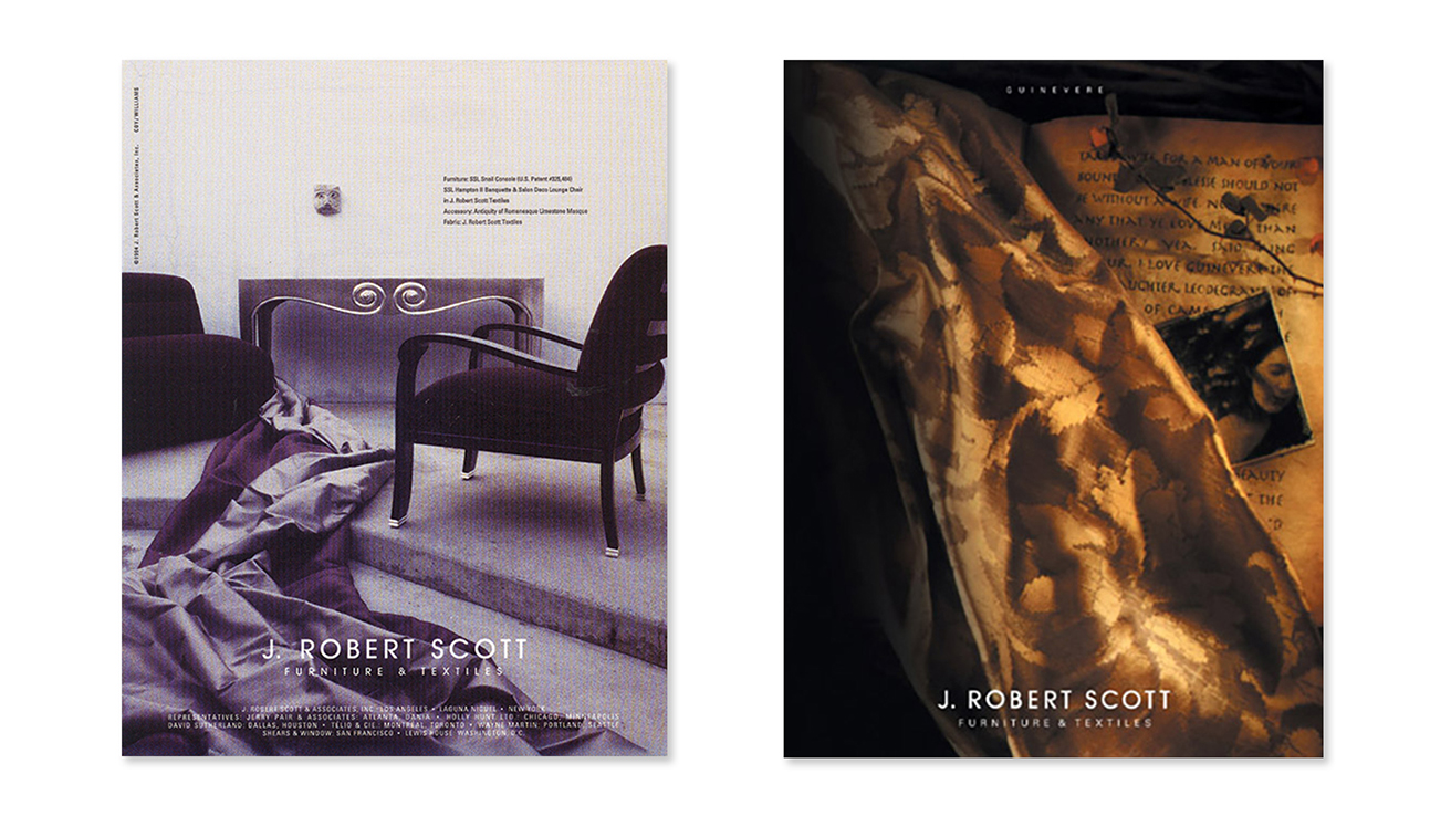
Date: 1994. Medium: Offset Lithography. Dimensions: Letter. Duty: Total Design, art direction, typography, prop design, image/color corrections, layout, production. Project Description: J. Robert Scott's designs elegantly blend artistic vision with masterful craftsmanship, creating luxurious environments that embody elegance. Advertisements highlight the brand's commitment to high design and timeless artistry. The left ad features a serene interior showcased by two signature furniture pieces set against soft textiles, emphasizing fine details through the interplay of shadow and light. In contrast, the proper advertisement displays an opulent textile alongside aged manuscripts and artwork, weaving a narrative of heritage and exclusivity with warm tones that celebrate the brand's expertise.
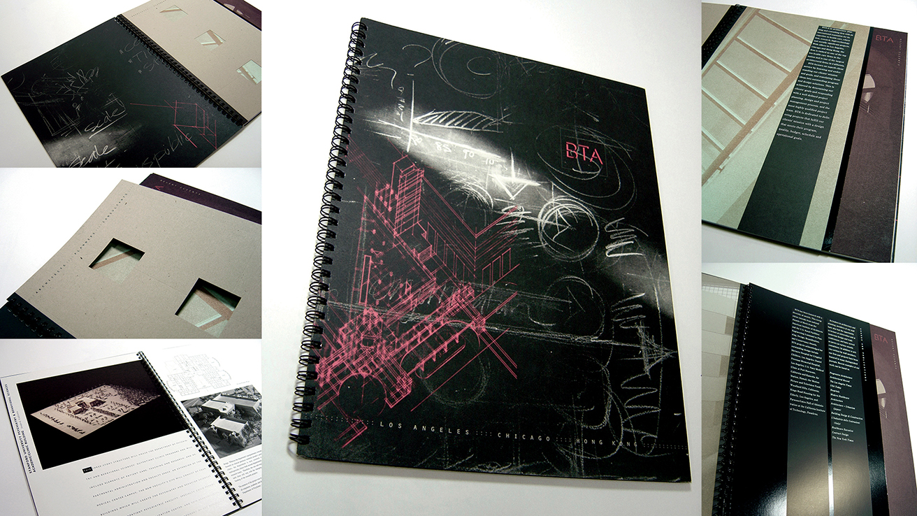
Date: 1994. Medium: 10-color Offset Lithography. Dimensions (mm): 210 x 300. Duty: Total Design, art direction, typography, photography, illustration, image/color corrections, layout, production, press direction. Project Description: BTA Architects, based in Los Angeles, USA, is known worldwide for its designs of hospitals, schools, department stores, and military facilities. The promotional catalog for BTA highlights the brand's image, corporate philosophy, design approach, and achievements. The cover features a chalkboard and sketches from a BTA brainstorming session, conveying a sense of artistic sensibility and strategic thinking. The use of sophisticated printing techniques reinforces the brand's refined image.
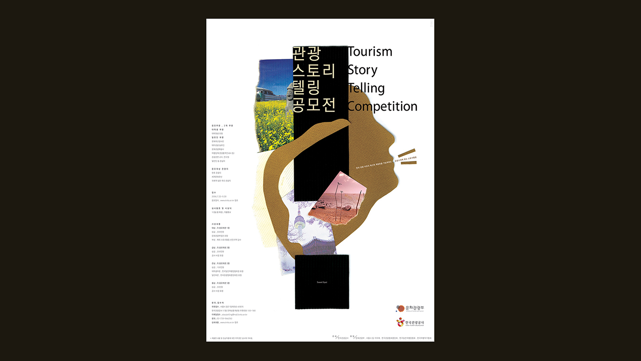
Date: 2007. Medium: Offset Lithography. Dimensions: A1 and A0. Duty: Total Design, typeface design, typography, photography, illustration, image/color corrections, layout, production, press direction. Project Description: The Korea Tourism Organization aimed to establish a strong identity for its inaugural tourism storytelling contest, focusing on a fresh portrayal of domestic tourism. Today's attractions are defined not only by their landscapes but also by the stories that enrich them. The strategy features a mosaic-style collage illustration in which individual stories are interconnected by shared emotions, represented by a black exclamation mark that signifies the unique experiences travelers gain through engagement with each narrative. By showcasing these captivating stories, we can increase awareness of these locations and reveal the true identity of Korean tourism.

Date: 2012. Medium: Container and Silkscreen Printing. Dimensions (mm): 60 x 60 x 65. Duty: Total Design, typography, product design, mock-ups, layout, production, press direction. Project Description: The FRUFÉ Whitening Water Sleeping Pack's packaging embodies hydration, vitality, and beauty, specifically designed for the modern Chinese market. Its water-inspired droplet design symbolizes rejuvenation. The vibrant color palette—comprising orange, blue, and pink—represents key benefits: radiance, deep hydration, and brightening effects. The semi-translucent material reflects the purity of water, while the light reflections on the curved surfaces enhance its premium look. With clean, minimal typography accented by a metallic sheen, FRUFÉ celebrates hydration and luminosity, appealing to consumers who prioritize beauty, purity, and a connection to nature.
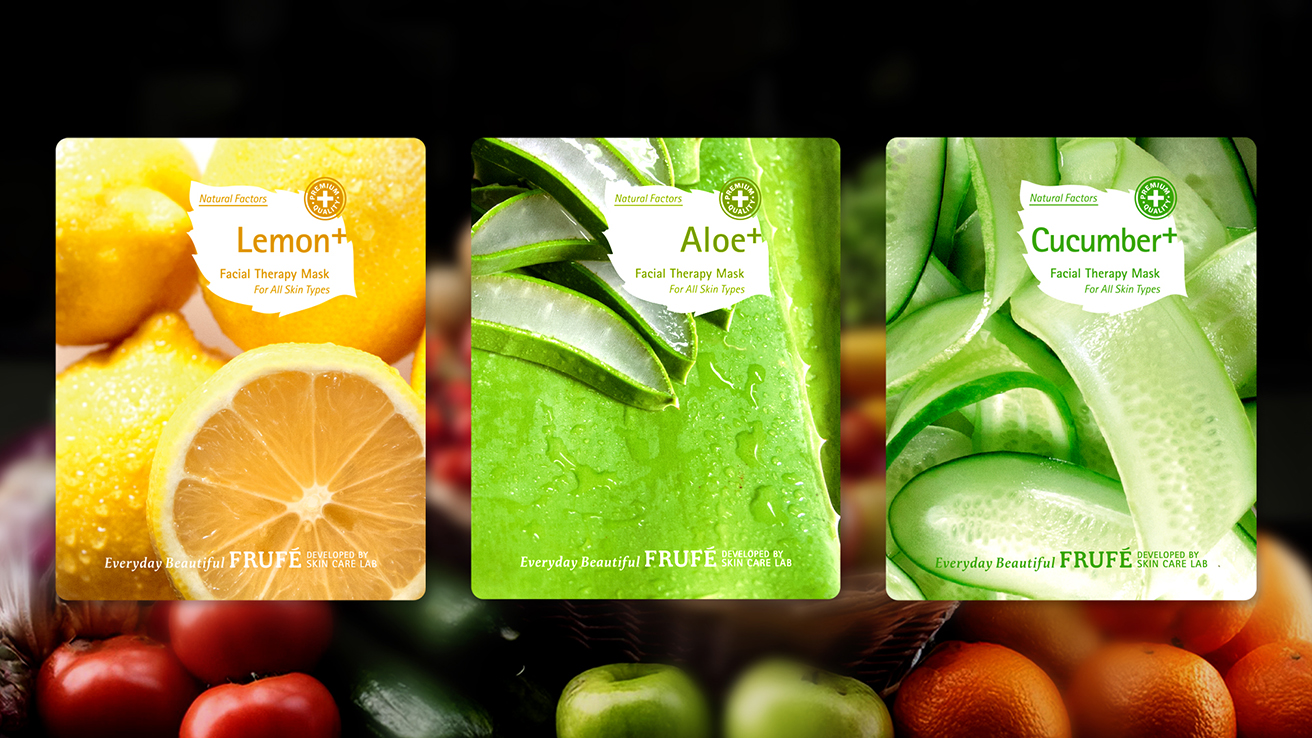
Date: 2012. Medium: Offset Lithography. Dimensions (mm): 130 x 160. Duty: Total Design, branding, typography, art direction, photography, slogan, concept copy, illustration, packaging, image/color corrections, layout, production, press direction. Project Description: The FRUFÉ Facial Therapy Mask packaging highlights the brand's commitment to natural beauty, featuring key ingredients like Lemon, Aloe, and Cucumber. Its vibrant colors—bright yellow for radiance, soothing green for hydration, and fresh light green for revitalization—create a sense of wellness. The straightforward typography and "+" symbol enhance effectiveness, while the tagline "Everyday Beautiful" promotes effortless skincare. The "Premium Quality" seal reinforces trust in FRUFÉ's solutions for all skin types, making radiant skin an achievable goal.
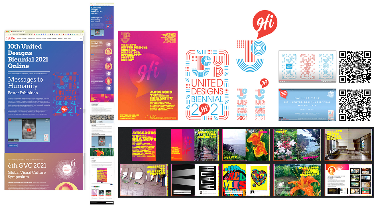
Date: 2021. Medium: Webpages. Dimensions: Interactive & Responsive Website Design. Duty: Total Design, logo, slogan, illustration, logo animation, motion graphics, poster, catalog, operation, copy writing, key image, layout, video, logo animation, webmaster. http://uniteddesigns.org/10th-united-designs-biennial-2021/ http://uniteddesigns.org/10ud2021-poster/. Project Description: United Designs is an international biennial event that begins with a gentle ripple effect, symbolizing the influence of design over the years. The logo features abstract patterns inspired by various cultural and design elements, which gradually come together to form the outline of the number "10," representing the tenth event of United Designs.
Gallery: Student Work

Date: 2020. Medium: Adobe Creative Suite, Microsoft PowerPoint. Dimensions: Digital. Project Description: Global Brand Design. 3rd year. The Samsung Pencook concept transforms the kitchen by integrating advanced technology with stylish design. It features smart appliances connected to a digital ecosystem, allowing users to control their cooking easily. Pencook offers personalized recipes, AI recommendations, and interactive guides for tech-savvy individuals and home chefs. Its modern design includes a unique circular oven window and a vibrant red-and-white color scheme. With a user-friendly tablet interface, Pencook delivers a seamless cooking experience that emphasizes creativity and precision.
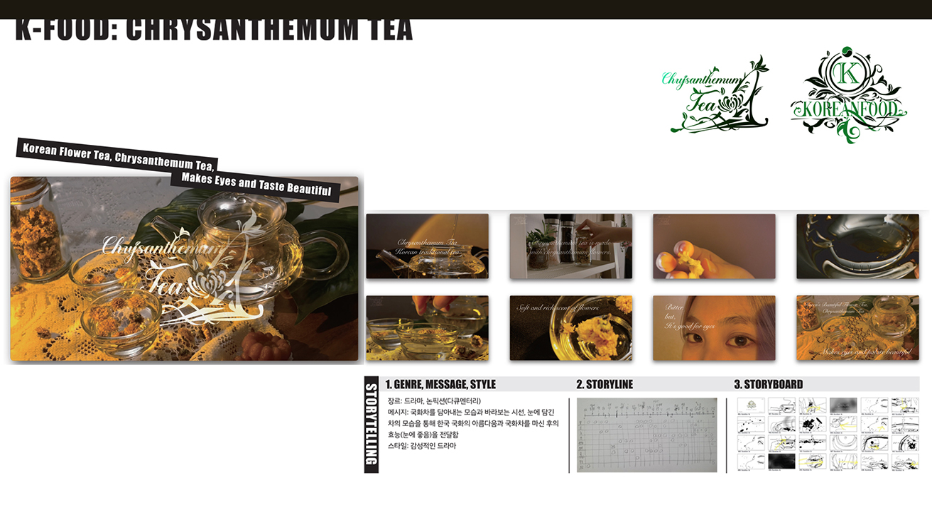
Date: 2023. Medium: Adobe Creative Suite, Microsoft PowerPoint. Dimensions: Digital. Project Description: Communication Design Methodology. 2rd year. The Chrysanthemum Tea project combines Korean flower tea's cultural heritage with a sensory experience. It highlights the tea's visual appeal, health benefits, and storytelling, encouraging a soothing tea-drinking ritual. Close—ups of golden blooms and serene sharing moments showcase this experience's beauty. The elegant typography and warm, earthy colors evoke calm and wellness, emphasizing that Chrysanthemum Tea is more than a beverage—it's a lifestyle choice promoting relaxation and a connection to nature.
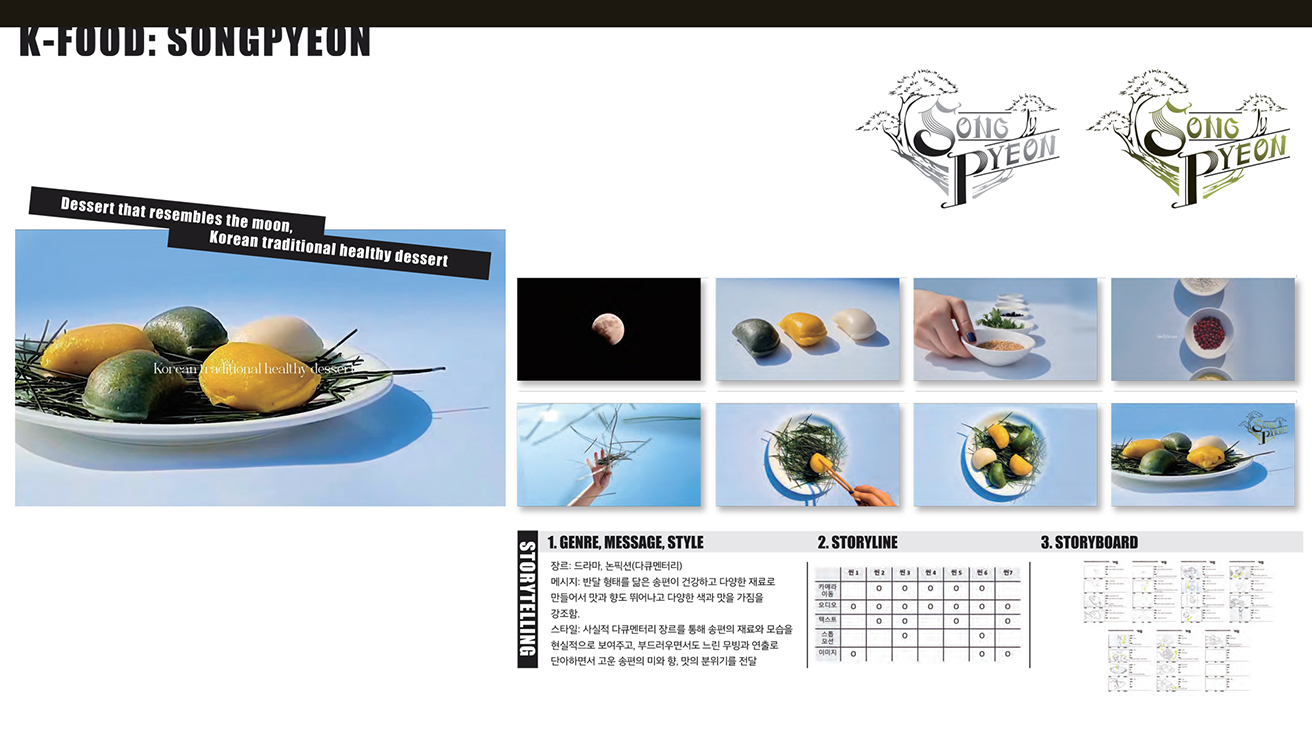
Date: 2021. Medium: Adobe Creative Suite, Microsoft PowerPoint. Dimensions: Digital. Project Description: Communication Design Methodology. 2rd year. The K-Food Songpyeon project celebrates Songpyeon, a traditional Korean rice cake representing cultural heritage, health, and harmony. Typically enjoyed during Chuseok, this crescent-shaped dessert symbolizes gratitude and family unity. The project's visual identity uses soft pastels to highlight the beauty and simplicity of Korean cuisine. Documentary storytelling connects Songpyeon's creation process to its cultural roots, showcasing it as a meaningful celebration of tradition and nature.
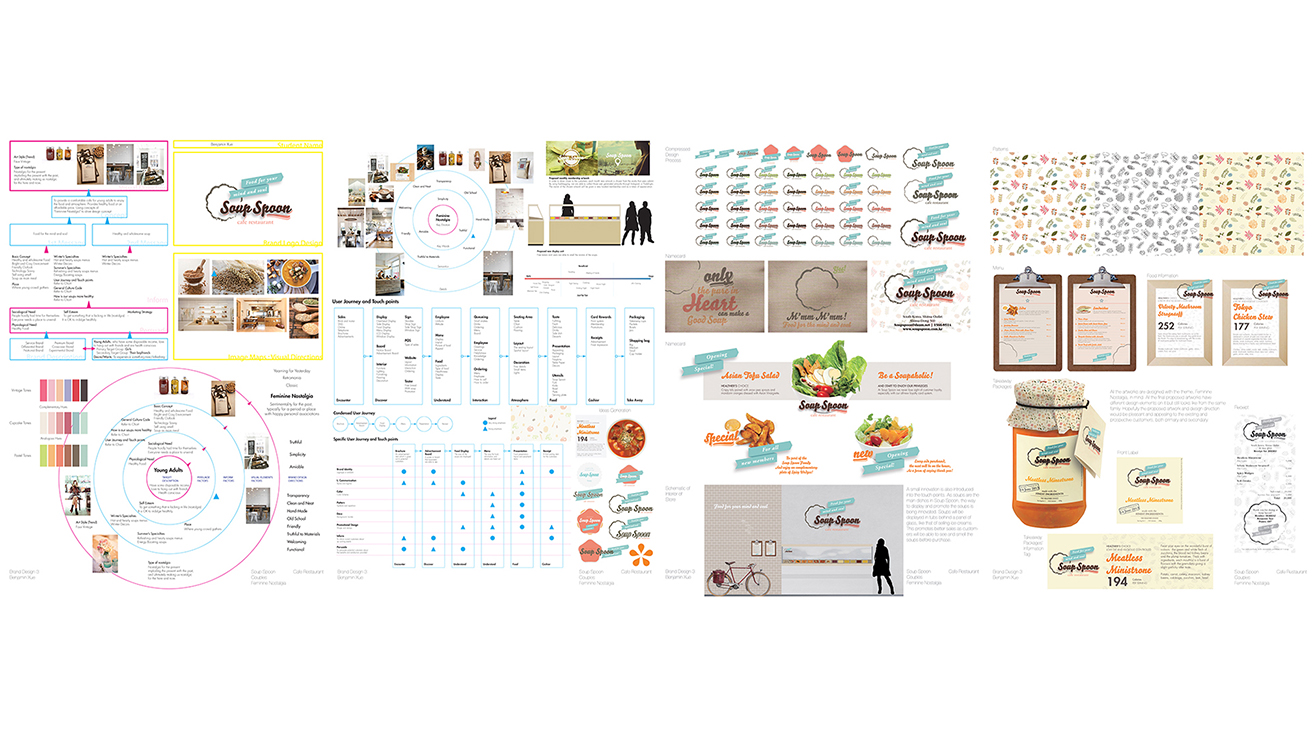
Date: 2014. Medium: Adobe Creative Suite, Microsoft PowerPoint. Dimensions: Digital. Project Description: Global Brand Design. 3rd year. Soup Spoon’s brand design blends nostalgia with modernity, creating a warm, wholesome culinary experience. It features soft pastel tones, hand-drawn logos, and natural ingredient illustrations, highlighting simplicity and artisanal quality. Eco-friendly packaging and heartfelt messages, like “Only the Purest Heart, Good Soup is Made,” reflect a commitment to health and emotional satisfaction. By merging tradition with a youthful aesthetic, Soup Spoon offers timeless nourishment.
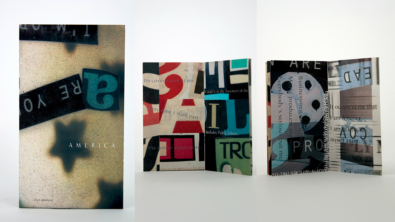
Date: 2002. Medium: Collage, Adobe Photoshop, Adobe InDesign. Dimensions: Pocket Size. Project Description: Experimental Design, UNT, USA. This experimental design brings Allen Ginsberg's poem "America" to life as a dynamic visual collage. It combines fragmented typography, bold textures, and layered imagery, creating a chaotic arrangement that reflects the poem's exploration of societal tensions, identity, and cultural contradictions. This design offers a tactile representation of America's complexity. By juxtaposing abstract visuals with overlapping text, it transforms Ginsberg's words into a rhythmic and thought-provoking experience, inviting viewers to engage with modern America's fractured yet interconnected voices.
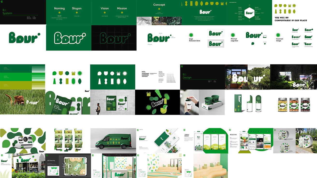
Date: 2023. Medium: Adobe Creative Suite, Microsoft PowerPoint. Dimensions: Digital. Project Description: A live project. Local Brand Design. 3rd year. Bour is a lifestyle brand that merges nature with modern living, offering products and spaces that promote comfort and harmony. Its identity features bold, rounded typography, nature-inspired shapes, and a green-centric color palette that evokes growth and vitality. Each element, from packaging to spatial design, fosters a connection to nature while appealing to urban audiences seeking relaxation and authenticity. Bour invites people to experience comfort, freshness, and sustainability in any environment.
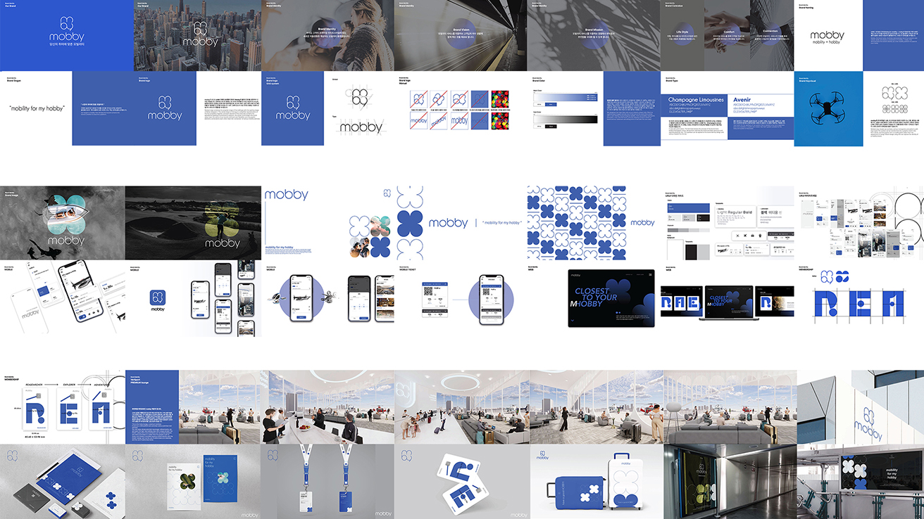
Date: 2023. Medium: Adobe Creative Suite, Microsoft PowerPoint. Dimensions: Digital. Project Description: A live project. National Brand Design. 3rd year. Mobby transforms personal mobility by connecting users to their passions through an innovative, technology-driven experience. The brand identity showcases modernity and accessibility with a clean, modular design in a vibrant blue palette that conveys trust. Playful geometric patterns inspired by movement add energy, while sleek typography and a user-friendly interface ensure clarity. Mobby’s unified digital and physical presence—across apps, signage, and environments—provides a seamless experience that brings users closer to what they love, wherever they are.
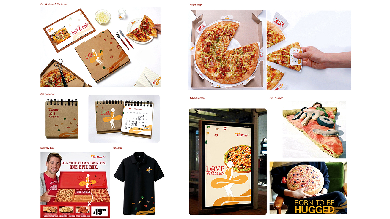
Date: 2016. Medium: Adobe Creative Suite, Microsoft PowerPoint. Dimensions: Digital. Project Description: Global Brand Design. 3rd year. Mr. Pizza's branding showcases a playful and innovative celebration of pizza as a joyful shared experience. With bold visuals, functional packaging, and engaging promotional materials, the design emphasizes creativity and user-friendliness. The "Love for Women" concept honors women as key patrons while promoting warmth and inclusivity. Unique features like "finger nap" tools, vibrant packaging, and pizza-shaped cushions enhance the brand's identity. Mr. Pizza delivers a meal and an enjoyable experience of fun, comfort, and sharing.
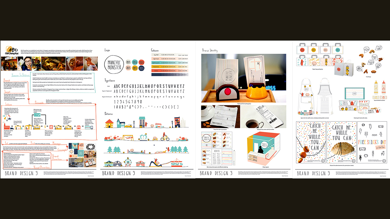
Date: 2014. Medium: Adobe Creative Suite, Microsoft PowerPoint. Dimensions: Digital. Project Description: Global Brand Design. 3rd year. Munchie Monster’s branding turns snacking into a fun experience with playful visuals, vibrant colors, and interactive designs. Featuring a hand-drawn logo, whimsical patterns, and lively typography, it appeals to families and young audiences. The cohesive branding system includes creative packaging and engaging promotional materials, reinforcing joy, accessibility, and quality. Munchie Monster’s cheerful design fosters excitement, making every snack a delightful moment to “Catch Me While You Can.”
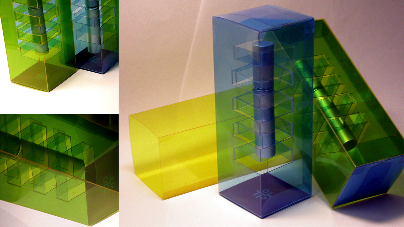
Date: 2003. Medium: Eco-friendly Bioplastic. Dimensions (mm): 50x50x150. Project Description: The award-winning perfume packaging design balances functionality and modern sophistication, earning 2nd place in the Young Package 2004 competition by the Design Centre of the Czech Republic. Crafted from transparent, modular materials in vibrant green, yellow, and blue, it creates a captivating interplay of light and shadow. The geometric structure enhances durability and elegance, transforming a traditional package into an artistic statement that redefines how perfume is protected and presented.
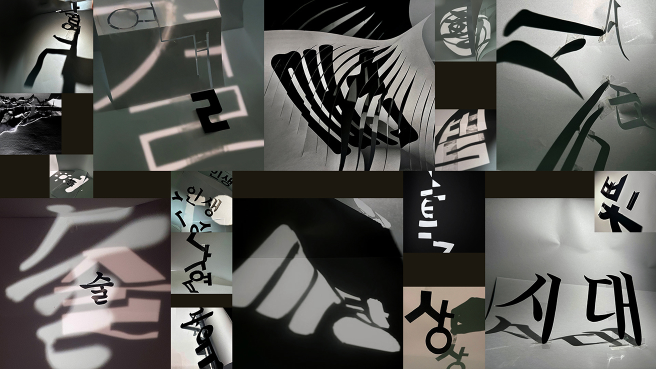
Date: 2020~2024. Medium: Paper, Glue, Tape, Iphone Camera, iPhone Light, Adobe Photoshop. Dimensions: Digital. Project Description: Basic Design. 1st year. This experimental typography project investigates the interplay between nature, time, and typographic form, transforming static characters into dynamic expressions. By manipulating light and shadow, the design shows how typography interacts with its surroundings, embodying movement and change. The shadows from deconstructed Korean characters create abstract compositions that convey emotion and rhythm. Thus, typography evolves beyond its traditional role, becoming a fluid narrative shaped by light and environment, reflecting the nature of time.
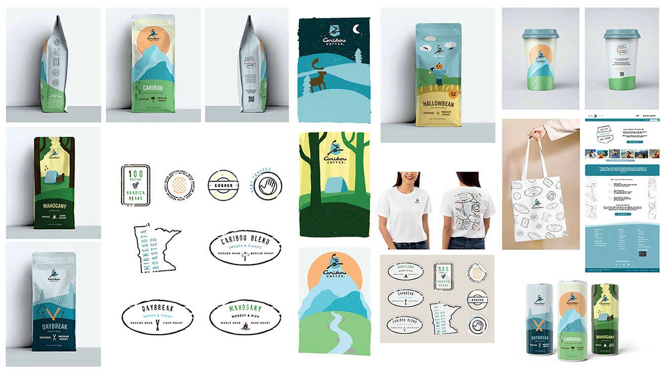
Date: 2023. Medium: Adobe Creative Suite, Microsoft PowerPoint. Dimensions: DIgital. Project Description: A live project by Cue, USA. Global Brand Design. 3rd year. Caribou Coffee's brand design merges nature, adventure, and comfort, rooted in its premium coffee experience inspired by the outdoors. With modern simplicity and organic charm, it employs soft colors and playful illustrations. The packaging features scenic landscapes and earth tones, highlighting the brand's commitment to sustainability. Overall, Caribou Coffee invites customers to enjoy a taste of nature's tranquility with every cup.
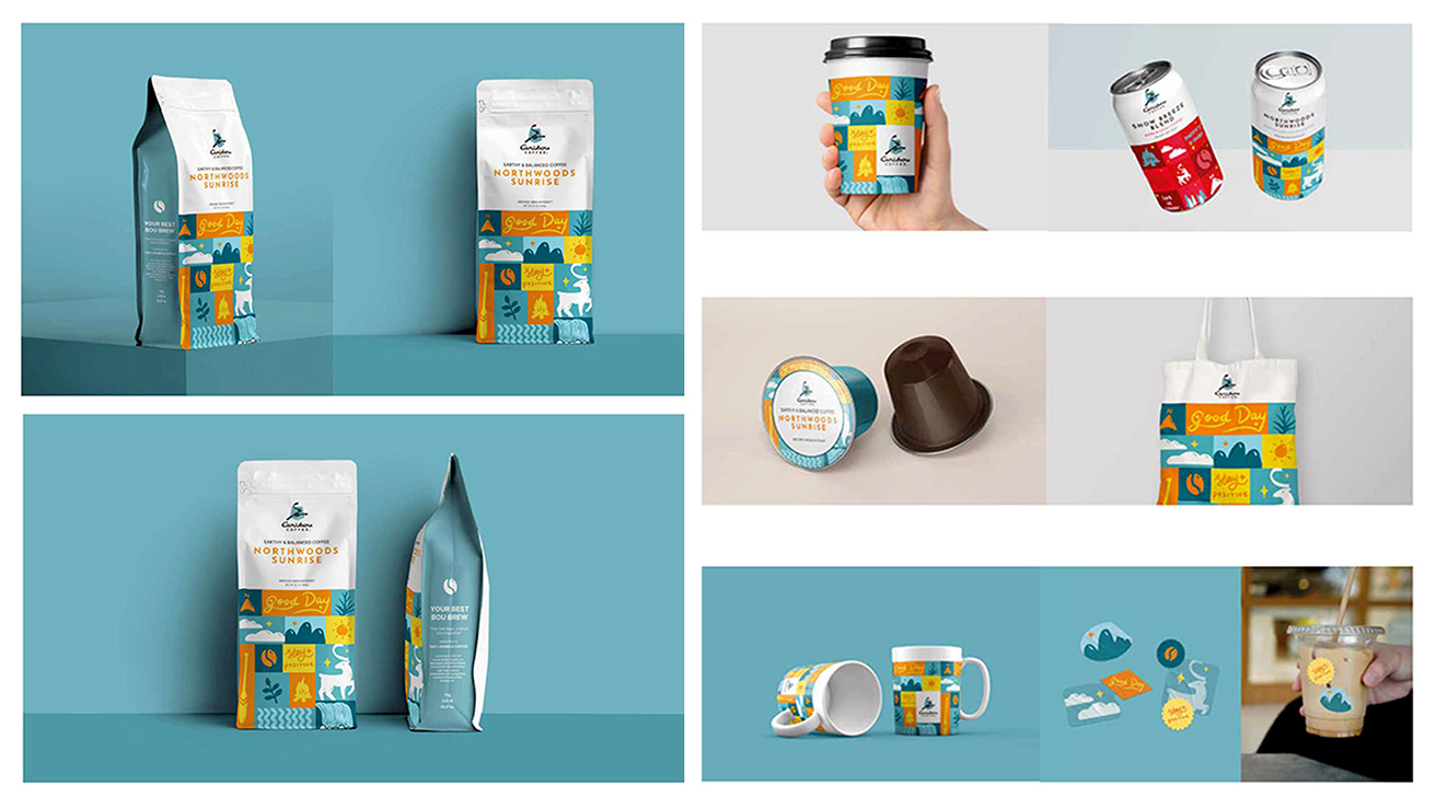
Date: 2023. Medium: Adobe Creative Suite, Microsoft PowerPoint. Dimensions: Digital. Project Description: A live project by Cue, USA. Global Brand Design. 3rd year. The Caribou Coffee brand design reflects optimism and adventure while celebrating the joy of the perfect cup of coffee. With bold graphics and a vibrant color palette of teal, yellow, and orange, it creates a warm and positive vibe. Inspired by nature, playful illustrations of forests, animals, and sunshine bring a sense of serenity to packaging and merchandise. This cohesive system captures the spirit of exploration and connection, offering an uplifting coffee experience that inspires a “Good Day” filled with energy and delight.
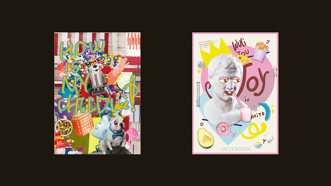
Date: 2016. Medium: Collage, Adobe Creative Suite. Dimensions: A0. Project Description: A Graduate Seminar, Typo-Image Methodology, Graduate Students, China. The experimental poster series explores the relationship between typography and imagery, evoking nostalgia and humor. The left poster, “How is My Childhood?”, features a chaotic collage of Lego blocks, cartoon icons, and vibrant text, reflecting the sensory overload of childhood memories. In contrast, the proper poster, “Joy is Wulitou,” humorously juxtaposes a Greco-Roman bust with modern elements like donuts and neon text, critiquing contemporary consumption. These posters challenge design norms through innovative juxtaposition and visual storytelling, creating an engaging narrative.
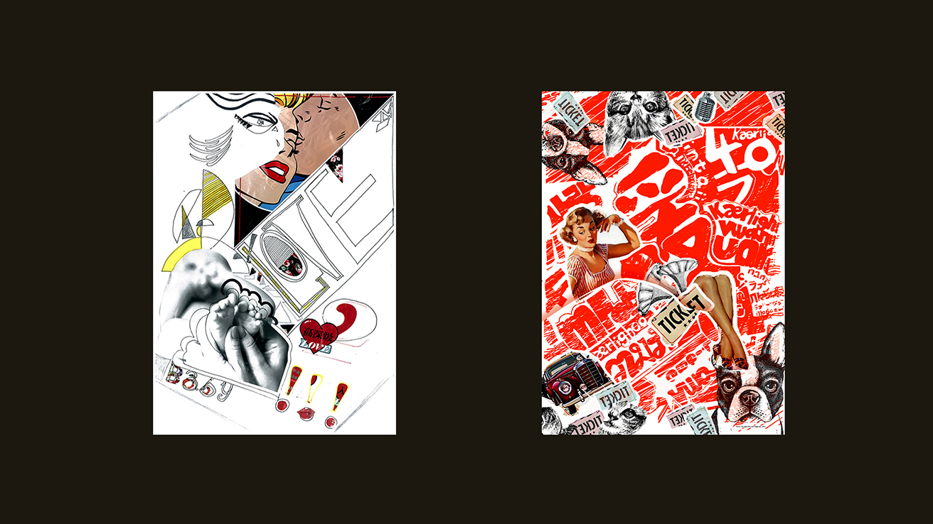
Date: 2016. Medium: Collage, Adobe Creative Suite. Dimensions: A0. Project Description: A Graduate Seminar, Typo-Image Methodology, Graduate Students, China. This experimental poster series explores the relationship between typography and imagery to convey emotional and cultural narratives through bold visuals. The left poster combines pop art and abstract expressionism, featuring fragmented figures and the word "LOVE" in a chaotic yet intentional manner, reflecting themes of intimacy and vulnerability. In contrast, the proper poster employs a vibrant red-and-white palette with collage techniques that evoke nostalgia and rebellion through overlapping text and playful imagery. Together, these works challenge traditional design methods and encourage the exploration of typography as visual art and narrative expression.
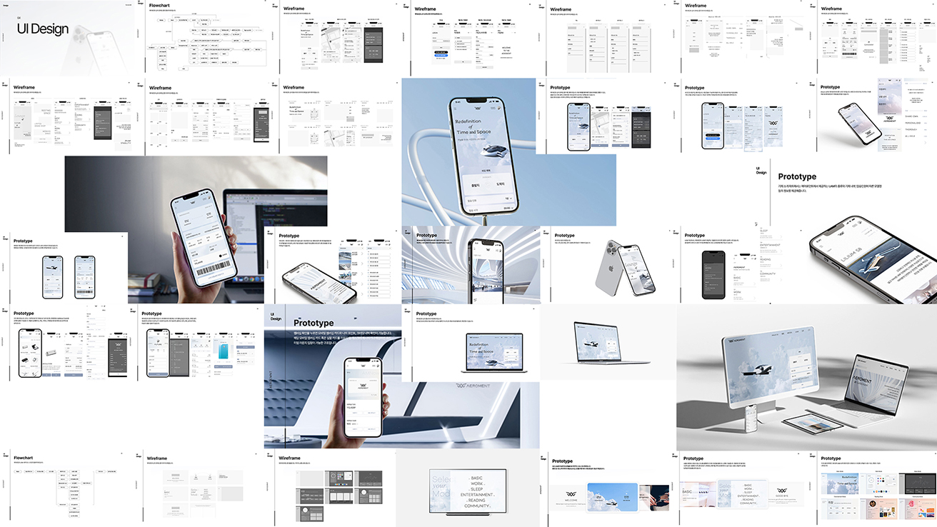
Date: 2023. Medium: Adobe Creative Suite, Microsoft PowerPoint. Dimensions: Digital. Project Description: Global Brand Design. 3rd year. This UI/UX project focuses on creating intuitive interfaces and seamless user experiences for digital platforms by utilizing flowcharts, wireframes, and prototypes. The design features a minimalist aesthetic with structured layouts and a monochromatic color scheme, prioritizing usability and effortless navigation. Responsive mobile and web prototypes enhance user engagement by blending aesthetics with functionality, aligning with the brand's modern identity.
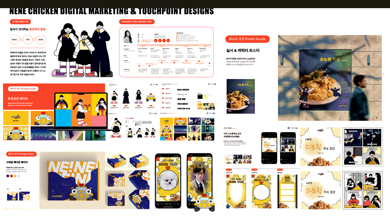
Date: 2023. Medium: Adobe Creative Suite, Microsoft PowerPoint. Dimensions: Digital. Project Description: A live project by NeNe Chicken. Communication Design Studio. 2nd year. This project transforms NeNe Chicken's digital marketing strategy to connect with customers more effectively. It appeals to families and younger audiences through playful storytelling and vibrant visuals. A cohesive visual system—including packaging, posters, and digital experiences—positions NeNe Chicken as a fun and contemporary brand. Character illustrations enhance emotional engagement, while a bold yellow and blue palette adds energy. Key digital touchpoints, like mobile apps and promotional videos, ensure consistent communication and build customer loyalty, making NeNe Chicken a memorable lifestyle brand.
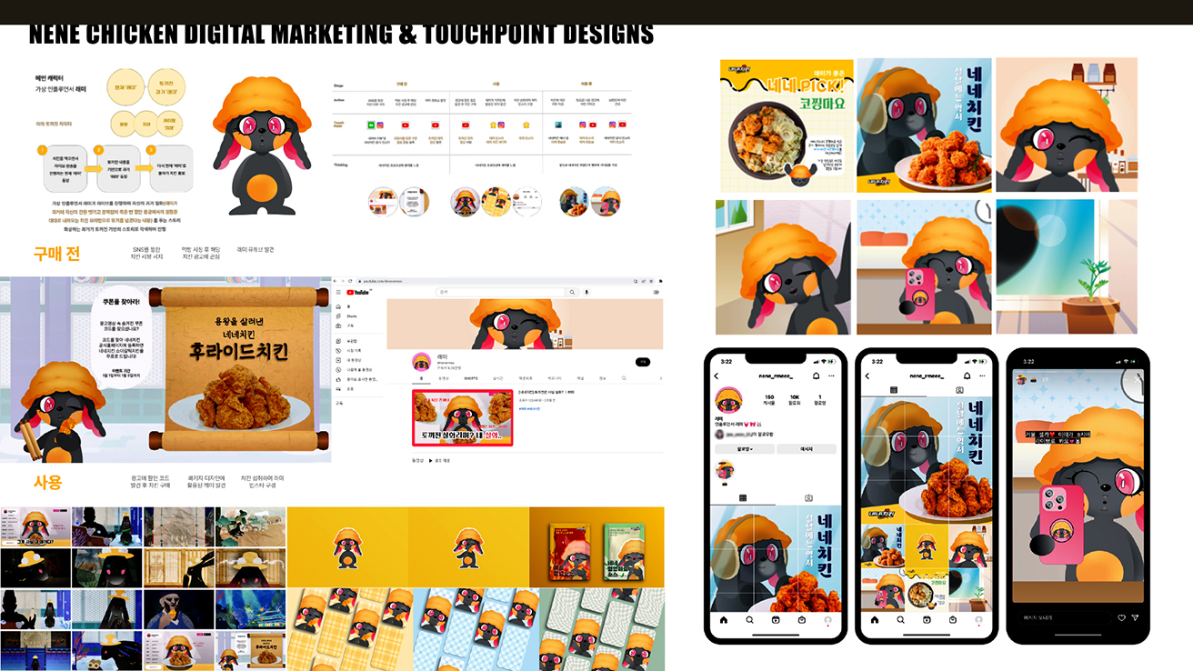
Date: 2022. Medium: Adobe Creative Suite, Microsoft PowerPoint. Dimensions: Digital. Project Description: A live project by NeNe Chicken. Communication Design Studio. 2nd year. The NeNe Chicken Digital Marketing and Touchpoint Design project aims to create a playful experience for modern audiences by combining storytelling and visual creativity. A charming mascot helps connect with younger consumers, while vibrant social media content and illustrations enhance the brand's presence. The cheerful yellow and orange color palette reflects the brand's joy. Strategically designed touchpoints, like YouTube banners and packaging, ensure a consistent narrative, positioning NeNe Chicken as an interactive brand that enhances its cultural relevance and market impact.
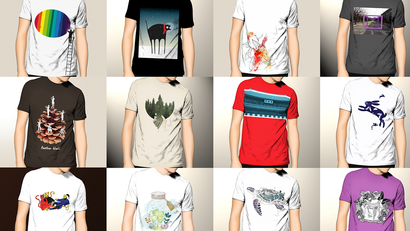
Date: 2015. Medium: Adobe Creative Suite, Microsoft PowerPoint. Dimensions: Digital. Project Description: A live project by the Design Innovation Project, USA. Communication Design Studio. 2nd year. The Target Autism T-Shirt Designs project artfully merges creativity with social purpose to raise autism awareness. Each t-shirt features visual storytelling through symbolic illustrations and playful elements that promote understanding and empathy. Aiming to engage diverse audiences, the designs emphasize themes of inclusion and sensory connection using vibrant colors and thoughtful imagery. By celebrating the strengths and creativity of individuals with autism, the project showcases how design can be a powerful platform for social impact and awareness.
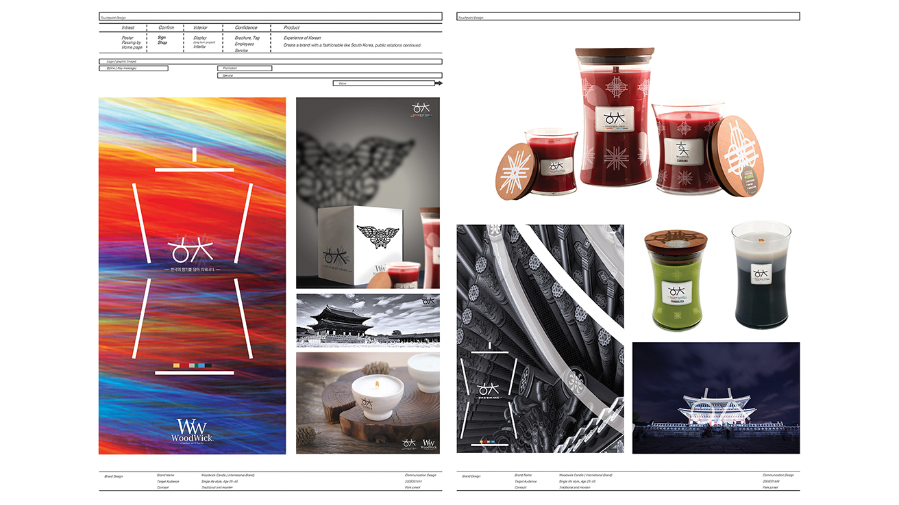
Date: 2019. Medium: Adobe Creative Suite, Microsoft PowerPoint. Dimensions: Digital. Project Description: Global Brand Design. 3rd year. The WooWick Brand Design project blends Korean heritage with modern aesthetics to create a sophisticated global identity. By incorporating traditional motifs, architectural patterns, and symbolic colors, it offers an immersive experience of Korean elegance. Utilizing geometric shapes and vibrant colors, WooWick transforms candles into cultural artifacts that combine storytelling and functionality. This approach appeals to global consumers seeking authenticity and refined aesthetics, positioning WooWick as an ambassador of Korean identity where tradition meets innovation.